Airline Website UX Case Study
This was the final project as part of my professional diploma in UX Design
Brief: to design and prototype a website for a start-up airline company focusing on a single use case: the flight booking process. The final design should be intuitive and user-centered.
Timeline: February - July 2023
My Role: As the sole person responsible for this project, I lead the entire design process including:
Research
Analysis
Usability Testing & Note-taking
Prototyping
Product Design
Annotations for developers
Where to begin?
The commercial airlines industry is a well established and very competitive industry. There are a lot of companies already providing a good user experience. However, there are still some areas which could be improved upon. Understanding these best practices and areas of friction was the natural place to start.
Research
How are other airlines solving the problem?
My first step was competitive benchmarking to establish what conventions are in place, what are the best practices I could emulate in my design and what areas are causing user friction.
Firstly, I identified four main competitors:
Aer Lingus, Air France, British Airways & Lufthansa
On each website I examined the user experience of booking a flight focusing on 4 main aspects of the software:
The homepage
The flight search box
The flight selection page
How users input their details

Understanding the User
Next step was to learn more about my target users. Specifically I wanted to know what were their goals, behaviour and the context in which they use airline website software.
I used a combination of observational and attitudinal research techniques in order to gain a more thorough picture of target users.
A short online survey with a combination of multi-choice and open-ended questions was a great method to gather both qualitative and quantitative data from a wide range of users. More specifically, I learned:
Basic demographic information about my users
The reasons they visit airline websites (goals)
The most popular airline websites
The features users liked and areas that caused user friction

Looking at things from the user’s perspective
Although the information I had collected so far was very useful, there were still some assumptions I had that needed to be challenged/validated. In order to do this, I needed to observe real users actually using the software.
I conducted a comparative usability test on two of the most popular airline websites; AerLingus and British Airways, to analyse the booking process directly from the user’s perspective. I began the session with an in depth interview to learn more about my target user and their previous experience of booking a flight. The aim was to discover user’s goals & behaviours, the context of use, best practices/conventions and pain points (if any).


Analysing and Structuring my Findings
After conducting my research I had gathered a mixture of qualitative and quantitative data that needed to be structured and analysed. I teamed up with a friend to review the findings and together we created an affinity diagram to organise the information into clear categories.

Search Flight box should hold prominent position on the homepage - searching/booking flights is the main reason why users visit the website.
Use smart defaults where possible - use all available data (gps, IP address) and make smart assumptions to fill in form fields. E.g. currency, departure airport, return option automatically selected. Less fields to fill in makes the process quicker and easier
Progress tool on the top of each page shows the user how far along they are and how many steps are required until they complete the booking
Continue as Guest - Sign In/Sign Up options presented to user but are not forced
Conventions & Good Design Practices
Areas for Improvement
Navigation Menu headers need to be more clear
Make the process more efficient - In some cases, the users found the flight booking process to be unnecessarily long and time-consuming. This was mostly caused by airlines having too many steps relating to add-ons & extras.
Information Overload - users are getting frustrated when provided with too much information and promotions. Users don’t take the time to consider options, instead scroll past them to find button to proceed
Cluttered Interface - Users are being shown too many promotions & as a result struggle to see the CTA to continue to the next step
Pricing - prices for add-ons should be clearly displayed. Users are reluctant to select extras if they don’t know how much they will be charged
Designing the Solution

Optimising User Flow
After categorising my research findings, the next step was to consider where most pain points occurred.
I mapped out the whole process and broke it down into 4 main phases:
Planning
Start of Booking Process
Search & Select
Complete Booking
A customer journey map helped me visualise my findings and highlighted two main areas of user friction - the Flight Selection page and the Add-Ons page. Since information overload and a cluttered interface were the main issues at these stages, this was something I would have to address in the early iterations of the design.
There were other areas in which I could optimise the user flow. Eliminating any unnecessary clicks/interactions would be key to streamlining the process and saving time for the user. The use of smart defaults (where possible) would also be beneficial. In order to do this, I created a flow diagram clearly showing each individual decision point and interaction made by the user. Mapping the ideal user journey at this stage would be crucial to ensuring an optimised and efficient user flow in the final designs.
User Flow Diagram
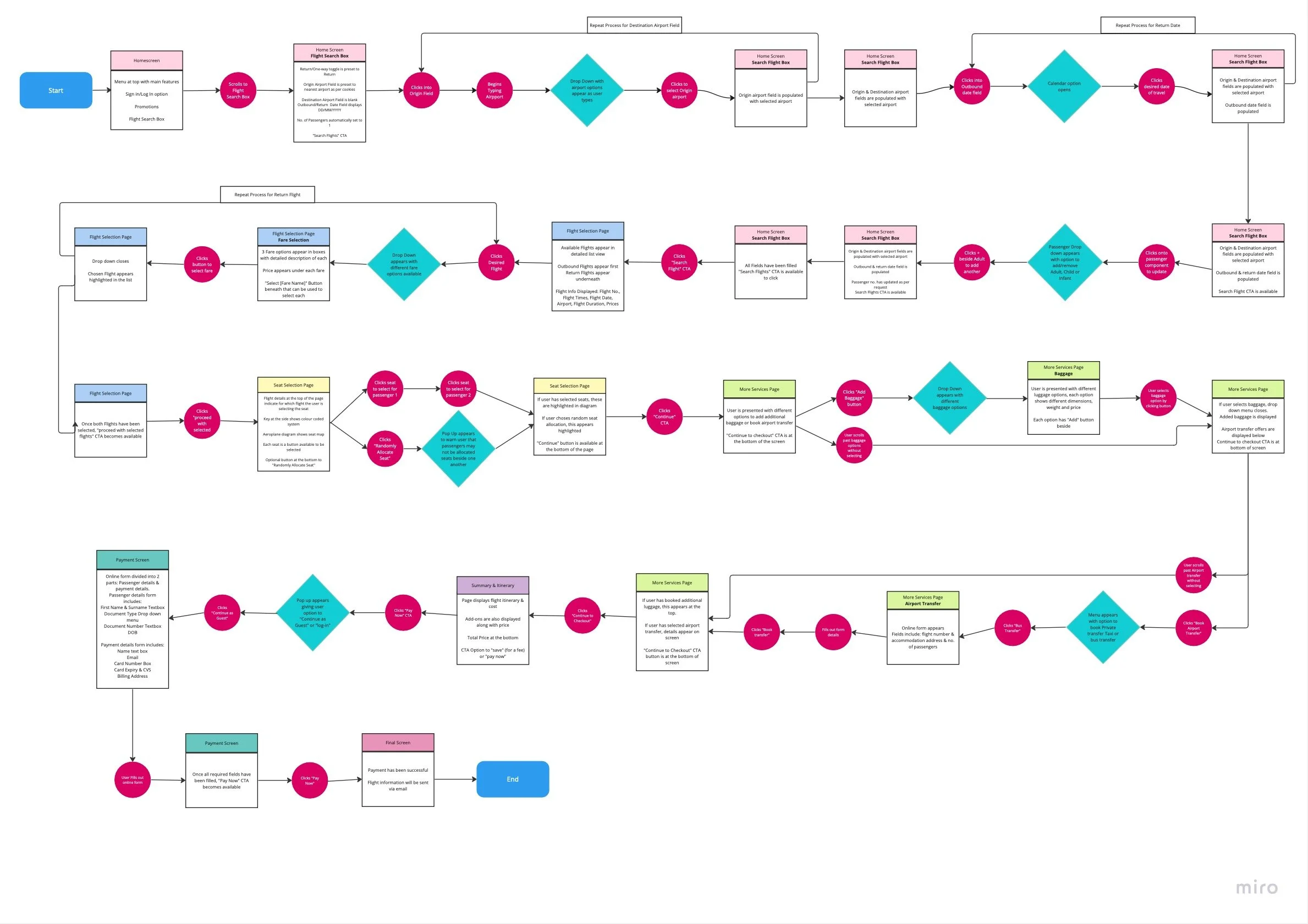
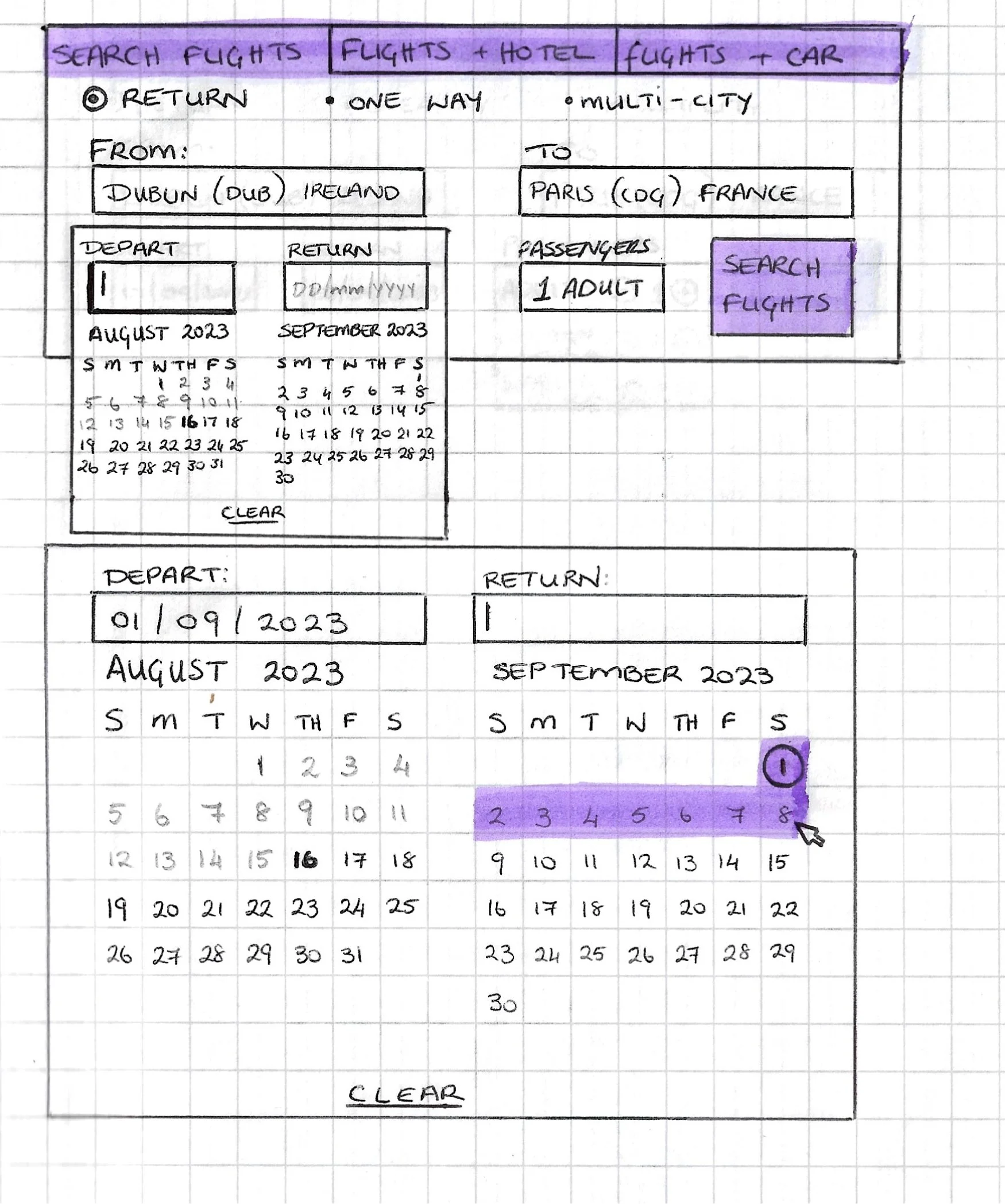
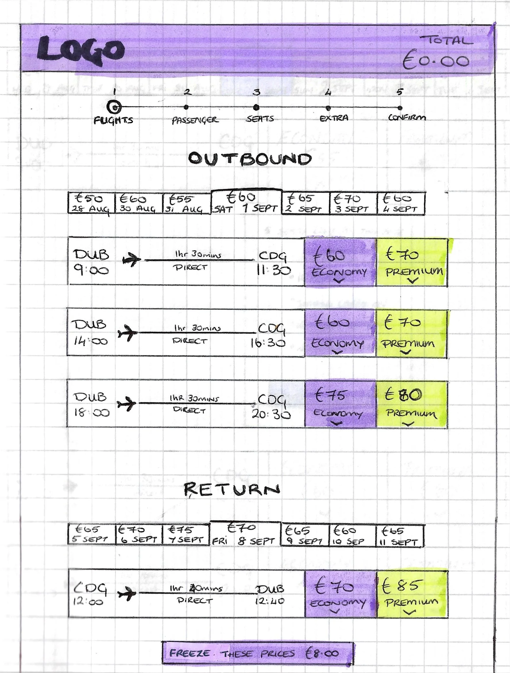
Beginning with a pen and paper, I kept my sketches very minimalist, resembling wireframes rather than a polished website. Only including key page elements allowed me to focus on the interactive elements in particular, paying close attention to user’s preferences and avoiding major pain points. During this step I also started thinking about which controls, rules and feedback were required for each interaction in order to provide the optimum user experience.
Image Carousel will optimise space and decrease clutter. This will give the airline space to advertise new destinations/promotions without cluttering the homescreen with excess advertisements. Also, during usability tests users responded well to seeing good quality travel inspired photographs on the homescreen.
Smart defaults are key to optimising the user journey:
Most passengers purchase a return trip, therefore this is automatically selected in the search flight box.
Origin airport is automatically populated to the nearest airport according to user GPS.
Based on cookies, website suggests destination airport which the user has previously searched
Most flights are booked for 1 adult, therefore this is set already.
Aeroplane icon clearly indicates departure airport/time.
During usability tests one user pointed out that on first glance it was very easy to mistake the arrival time for the departure time. Adding the plane icon beside the departure airport/time adds more emphasis to this to avoid any confusion.
Decluttered Add-Ons page with clear and simple structure.
From research it was clear the Add-Ons/Extras page was the main point of user friction. Cluttered interfaces & excessive promotions meant an unpleasant user experience. Often users felt deceived and tricked into buying unnecessary extras.
Again, the use of tiles provides clear structure to the page and prevents information overload. Presenting information like this provides clarity and transparency to the user, establishing trust between the user and the brand, enhancing the user experience and increasing customer satisfaction.
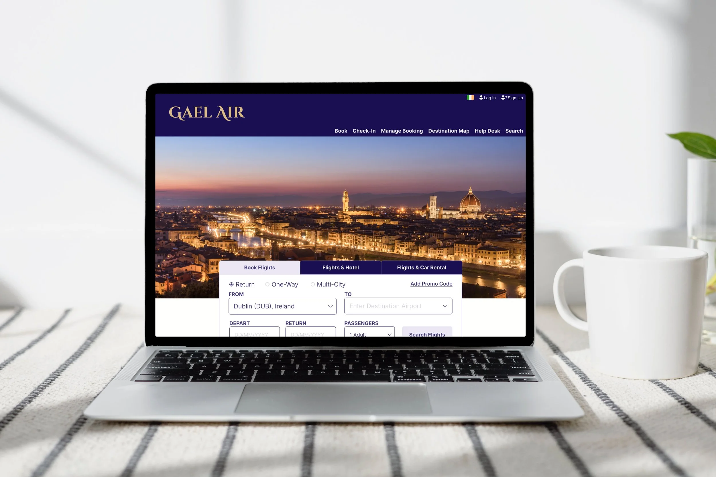
Homepage
Initial Sketches

Flight Search Box


Flight Selection Page
“I like to use [] the calendar like this, I like to scroll over instead of entering it in...I just like to see the whole month with the calendar there clearly for me...”
Add-Ons Page

Navigation Menu has clear heading so user can quickly & easily find exactly what they are looking for.
Flight search box is the most prominent feature on the page. As this is the most frequently used feature on the site, it is important that the user can locate it quickly, making the flight booking process more efficient.
Input fields are optimised to suit users preferences. User may manually input information (typing) or select by click through drop down menus and buttons. Allowing the user options to input based on preference makes for a more positive user experience.
Use of tiles & tabs increases scanability and optimises user flow.
In order to chose a flight, users need a lot of information: flight departure/arrival times, origin/destination airport, flight duration, direct flight/stopovers, price, etc.
When there are many flights displayed on the same screen, this much information could cause a cluttered interface and lead to an unpleasant user experience.
One possible solution would be to reduce the amount of information displayed onscreen and include further information in a pop-up that open when clicked. However, I believe adding unnecessary clicks would only interrupt the user flow. Therefore, I opted to use tiles instead.
Using tiles to display information for each flight reduces the risk of information overload. One tile per flight allows a more simplified view without compromising on details.
Clear prices displayed throughout the process increases transparency, user trust & brand integrity.
Prototyping & Handover
I decided a medium-high fidelity prototype would be the best option as this would give me richer insights when it came to user testing. I used Figma to create a clickable prototype and once I was happy with my design, I did another round of user testing to validate the solution and ensure there were no pain points in the final design.


Annotating the final Designs
After finalising my prototype, the last step in the journey was to complete handover documents for the developer to accurately build the product. This involved creating detailed annotations explaining all the necessary rules, controls and feedback for each action.
